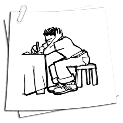
I was on the East Coast last week, to celebrate my Mom's 60th birthday in Boston, and see my dad in New York. Traveling always screws up my ferocious media consumption schedule: stuffed into my proverbial dog carrier, I'm forced to subsist on a lean mixture of cable news kibble and the occasional internet gruel. Being denied my usually over-the-top levels of wonkish political inspection is a forced starvation diet that's good for me, I think: during this interminable primary debacle fuckshow, I've actually spun out of the newscycle, exhausted, and then come back in...twice. It's the same reason I refuse to get a smart phone: I think if given the opportunity to be connected all the time, I just might drive myself insane. Like every good New Englander, I believe in a healthy dose of denial.
However, not having a completely and totally dissected political view was a boon to me in at least one regard: I was able to see the broad swath of the media narrative in much cleaner sense (er...not "cleaner" in the Joe Biden way.) As with any long, involved subject, being close to it sometimes allows the serrated edges to get in the way, and you lose track of the general direction. And the direction I saw was pretty obvious.
Let me state for the record, for whatever it's worth, that I'm a Barack Obama supporter: but I found it fascinating how the media turned off Clinton's chances like a light switch. For all intents and purposes, Hillary's chances pretty much tanked in early March: even after Pennsylvania, the math just wasn't there for her. The media allowed the horse race to play out because it was good news filler for the 24-hour stations and blog heads, and because, well, that's the way the nominating process works. But something weird happened after North Carolina and Indiana. They just sort of...shut off the switch. Even after Obama took a drubbing in W. Virginia, the NYTimes gave it a blurb below the fold at the bottom of the page: no picture, even.
This isn't a political blog, and I'm not to about blame vast media conspiracy for anything for than following the dog the richest smelling shit. But the fact that it took a bit of distance for me to see the full scope of a media arc was informative, and it began me thinking on a subject that dominates a lot of my mind: who is the taste maker, and where does the influence come from?
Narrative arc, be it for someone's career, political fortunes, or a cause, is a fickle and powerful tool, and is often times disturbingly close to innuendo, rumor, and hearsay. Going green is cool. Bill Clinton ruined his political fortunes. Lindsey Lohan is a drunk, Gary Busey is insane, George Clooney is a cool guy. The Iraq War was the right thing to do until about 2005, and now it was totally the wrong thing to do.
The conventional wisdom, and it's accompanying narrative arc, confuses and titillates me, because it seems such a ridiculous and arbitrary thing, that if harnessed, results in awesome power and riches; I 'spose it's kind of like the Cool Stock Market. The Tao Jones. Heh.
The tastemakers these days, much to the MSM's chargin, now lie firmly in the blogs and netroots, and for that, I'm glad: as someone who's tasted the brief power of a few BoingBoing links, I can attest to the new market's force. I'm not a political expert, and as I said, I didn't follow the web rumble up to the moment that the MSM turned out the light's on Hillary's campaign. But I wonder: what happens when the two don't work in concert?
This gets back to a more germane concept in regards this blog's theme, which is design and art and cartoons and everything in between, and wonder out loud whether there is a push or pull in design and identity, and how that works: does a preconceived notion of Obama as winner cause photographers to photograph him more heroically? Does the prevalence of zombie movies influence our scares about viral diseases, or do the disease scares cause the movies popularity? It's all a very tricky and interconnected labirynth of influence and confusion that I'm not about to pin down definitively. I don't pretend to have the answers. But it sure has been rattling around in brain a lot.

Showing posts with label influence. Show all posts
Showing posts with label influence. Show all posts
Saturday, May 17, 2008


Thursday, February 28, 2008
Sketchblog 2/28/08

Above is another poster in the series I'm doing for Blue Flavor. You can see the first one here.
I like this one quite a bit: the palette reminds me of some late 60s children's books I used to pore over as a kid: heavy, red-influenced blues with some orange-reds, a seemingly popular color scheme at the time and one that I still can't get out of my head. I often wonder how much one's visual aesthetics is influenced by one's very early development window of colors and shapes. I love (and always use) that type of bright sky blue: did I have a crib that color at some point? I have to ask my parents...
Monday, February 18, 2008
Sausage Factory: Done Got Hitched, Part 2
Molly's out of town this week, so it's just me and the cats and the Mac, which leaves ample room for some real nerdly design work. I've got some great paying stuff coming up that I'm looking forward to, but right now I've got the looming project that is far more pressing: figuring out how our wedding in November is going to be graphically represented. This is the second part of a series. You can see how we got to this point here.
I don't have much to say except that this is harder than I initially thought, and I'm not sure whether it's because it actually is a challenging project, or that because it's so personally important to me, I'm hyper self-aware. In any event, I think I'm getting closer to where we want to be.
Diving right in to what I did tonight:

I like this, because it gives a nice feel of that beeeeautiful Haeckel etching that I've latched on to, and it also brings an element of art nouveau wallpaper in the background, as it feels like it's being pinned up on a wall. It's way too busy though, with too many colors.

I like this one more because it brings the elements together, but again, while I love the design, the pinks leaves me limp. Next.

This is the choice for the understated fan that likes to let the art speak for itself, and I can see that point of view, I really can. To me, it seems a little snoozely, but then, I'm also a guy who likes a lot going on in a design.

NOW we're cooking with gasoline,, baby. This sucker jumps right off the page, and seems to be modern while at the same time hewing very close to the design of yore. I like this one a lot. But I'm only half the deciding team, so who knows what The Boss will bring down.

I like this one a lot, too: with the addition of the red pitcher plant, it suddenly takes on a vaguely Spanish feel for some reason, which I'm not totally against, though neither Molly nor I have anything to do with Spain at all. I like that is starts to recall art nouveau moving into more stylized form, and is hence historically accurate for the time period we want to evoke. The drawbacks are that it's kinda vaginal, which might come off as weird. But, hey! Everyone loves vaginas!
Like I said, I'm alone all week, so there will be a ton more of these being cranked out. Stay tuned...
Wednesday, March 07, 2007
Remixology 101

There’s an apologetic reflex I think, the happens in the mind of all but the most arrogant artists when they take up their weapon of choice again after seeing something wonderful and inspiring created by someone else. After the initial thrill of imbibing that heady elixir of admiration, self-consciousness, jealousy, and inspiration that always leaves me a bit woozy, there’s a very natural fear that comes back up like a bad tequila burp. It’s the fear that you have now been ruined forever, that your mind has been permanently scarred by someone else’s superior vision, and your life will be nothing more than common retreads of other’s themes for the rest of your life. Those of normal psyches quickly banish this thought and charge ahead, confident in their own abilities. Those that don’t, blog about it.
There was an outstanding Harper’s article a few weeks ago by the untouchable Jonathan Lethem about the innate quality of appropriation in art: I read Joey “Yeah, I seen that shit” Campbell as closely as the next film student, but I have to admit, it paradoxically made my heart both lighter and heavier to find out that one of my most favorite books, Lolita, had been possibly plagarized. The article, among other examples, asserts that, consciously or not, Nabakov essentially strip-mined a story he most very likely read 20 years before. However, instead of waving the flag of crime in his face, Lethem asserts what many have deduced, and then rolled with, long ago: there ain’t nuthin’ new underneath the sun.
I don’t mull this over for unreasonable means: I’m not usually in the habit of just repeating what an article said and passing it off as my own (though, considering the topic, might be just what the doctor ordered). Last week, I was suddenly reminded of the anime film Metropolis , a cartoon released in 2002 by Tezuka that was essentially a remake of Fritz Lang’s Metropolis.
The path of sly reference, unwitting allusion, accidental cop, and outright stealing is sticky one. Before seeing the film, I had loved the Fritz Lang film since I first saw it at 16. With the addition of M, Lang was one of the twin giants that informed my narrative aspirations (along with Hitch, or course). Plus, it had totally awesome robots and cool models of a futuristic city.
I have kept the film so near and dear to me, that, in the back of mind, I always harbored a secret to desire to remake it, but my way: a production design project in school resulted in The Wizard of Oz, re-imagined as a Langian shiny future dystopia of Art Deco buildings, an evil newspaper magnate moll as the Wicked Witch of Western Publishing, and a robotic Prometheus as the Tinman, It was as strange and brooding day then, when, shocked at my discovery of the Tezuka release, I made the even-more shocking discovery that, after renting the film and watching it, I HAD in fact seen it, in 2002 when it came out. My robot poster series, which the comic is based on, came out in 2004. Infer what you will.
I don’t really know what to make of all of this. (The fact that the Tezuka movie, much to my disappointment, is a sub par affair is besides the point). A few points in my defense is that my conceit takes a wholly different tact than either version of the film, and I’m exploring (or plan to explore) a lot of issues that aren’t raised in the movies. However, I am writing a comic about an uprising of robots. I did name my city Cosmopolis as an intentional nod to Lang. And I do stay up late worrying as to whether people will take one look at my comic and see me as an also-ran.
On an even greater intellectual level, though, the whole thing has left me befuddled. The brain is apparently a very strange thing. Did I mean to skip over the 2002 version in my allusions? How much did the 2002 version influence me, considering that I seemingly removed the movie from my mind for a while, always going back to the Lang version? To that end, would my intended allusions to Lang (which I desire), be even stronger had not I seen the 2002 version? Are readers, especially those not familiar with Lang, put off by my apparent band-wagoneering? And in the ultimate question, in the art world, who is to say the art world is nothing but appropriation?
I’m always flattered when someone cites my work as an inspiration for theirs, so I guess I shouldn’t think on any of this too much. It sure makes it easier to pass the time at work, though.
Subscribe to:
Posts (Atom)