Joe Alterio's blog on illustration, comix, design, animation, and other bouts of total awesomeness.

Showing posts with label wedding. Show all posts

Friday, August 01, 2008

The Love Is Strong In This One


Damn, dude.

Here's a little secret I'll let outta the bag for my loyal blog readers: planning a wedding sucks. You got your food, your booze, your decorations, the accomodations for the guests, and all the other crap. But whenever I get down, I think to myself, "At least I don't have to coordinate who's going to be Rebel, and who's going to be Empire."

Peep professional photographer Justin Winokur's Flickr set of this all Star Wars wedding he shot in LA.

Oh, that Uncle Dave: always drinking too much, hitting on the young girls, and wearing the wrong shoulder insignia on his Imperial Starfleet uniform.

Thursday, May 08, 2008

Design Sausage Factory #3: Done Got Hitched


As you may know now if you're invited, we finished our Save The Date about a week ago. We're both really happy with it: as you can see from the above, I went back to the original look for the back side, and let the art on the front side speak for itself. The art is actually done by my mom. After weeks of scouring hundreds of images from the San Francisco library (kind of a crappy library for such a big city, if you ask me), wiki images, and bookstores, I finally appealed to my mom to create what I was looking for, and it's perfect. To suddenly be on the otherside of the equation - trying to art direct an illustrator about the vision in my head - was an enlightening experience. In any event, she did a great job, and these things look amazing. Thanks to my dad, too, for the printing. Sometimes it pays to have a graphic family, you know?


Looking at the other posts about this, I think the thing I take away again is that I sometimes have a tendency to get too tricky: too many cues, influences, and signifiers of the feeling I'm trying to impart. As a long time illustrator but less experienced designer, I just need to trust my audience more, and not let my illustrative instincts get in the way. The reason the first version didn't work, and this version does, is because the single theme is uncluttered by competing, subtly different messages. It really is true what they say: keep it simple, stupid.

Monday, February 18, 2008

Sausage Factory: Done Got Hitched, Part 2

Molly's out of town this week, so it's just me and the cats and the Mac, which leaves ample room for some real nerdly design work. I've got some great paying stuff coming up that I'm looking forward to, but right now I've got the looming project that is far more pressing: figuring out how our wedding in November is going to be graphically represented. This is the second part of a series. You can see how we got to this point here.

I don't have much to say except that this is harder than I initially thought, and I'm not sure whether it's because it actually is a challenging project, or that because it's so personally important to me, I'm hyper self-aware. In any event, I think I'm getting closer to where we want to be.

Diving right in to what I did tonight:


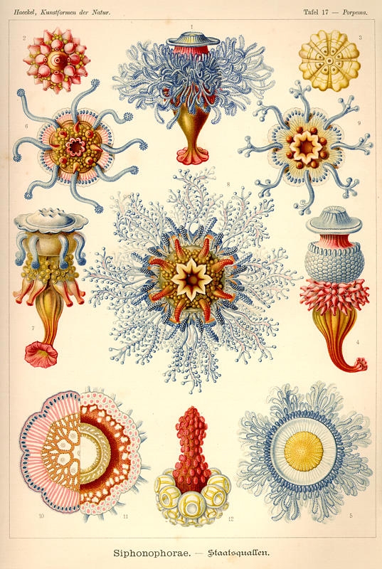
I like this, because it gives a nice feel of that beeeeautiful Haeckel etching that I've latched on to, and it also brings an element of art nouveau wallpaper in the background, as it feels like it's being pinned up on a wall. It's way too busy though, with too many colors.


I like this one more because it brings the elements together, but again, while I love the design, the pinks leaves me limp. Next.


This is the choice for the understated fan that likes to let the art speak for itself, and I can see that point of view, I really can. To me, it seems a little snoozely, but then, I'm also a guy who likes a lot going on in a design.


NOW we're cooking with gasoline,, baby. This sucker jumps right off the page, and seems to be modern while at the same time hewing very close to the design of yore. I like this one a lot. But I'm only half the deciding team, so who knows what The Boss will bring down.


I like this one a lot, too: with the addition of the red pitcher plant, it suddenly takes on a vaguely Spanish feel for some reason, which I'm not totally against, though neither Molly nor I have anything to do with Spain at all. I like that is starts to recall art nouveau moving into more stylized form, and is hence historically accurate for the time period we want to evoke. The drawbacks are that it's kinda vaginal, which might come off as weird. But, hey! Everyone loves vaginas!

Like I said, I'm alone all week, so there will be a ton more of these being cranked out. Stay tuned...

Wednesday, January 30, 2008

Sausage Factory: Done Got Hitched, Part 1

So I've decided to start doing something on this blog I'd like to call The Design Sausage Factory, because I like the sound of that, and I've had a little wine and it sounds totally fine to me right now. I thought it might be cool to document how a design or illustration that I'm working on starts out when it's first concepted, and then update it with various installments until the final product comes shooting out the gristle-caked slough onto the slick factory floor below, glistening with fatty design-y residue of another concept hog butchered in the name of an idea . I'm always really amazed at how certain design projects and tones can change over the course of time, and I never really save different iterations, so I figure this is as good a venue as any. Not only do I get see myself how it progressed, but so do all seven of my readers. (Hi, Dad!) So strap on your company-issued hard hats, folks: the factory floor calls!

The project in question is actually one of a rather personal nature, which is great because I actually care about it more than most (just kidding, paying clients!). As you may know, the lovely Molly and myself will be getting married this November, and such a big event of this nature always is in need of some serious design direction. Without a cohesive identity, defined themes, and a sensible pallette, the whole thing will spiral out of control, we'll break up, and the building we're getting married in will probably set on fire. I really, truly believe this. This is what happens when a visual nerd gets married.

(...and for those of you guys out there who think that I'm being a sissy for caring about the visual identity of my wedding: turn your back on your girl for a second, and you may end up wearing a pink bowtie. Heed me now!)

In all seriousness, though, there were certain tones and themes that both Molly and I talked about wanting to evoke, and so the closer we hit to our mark, the more success we feel the event will be.

So.

Step One: Themes

Luckily, I happen to be marrying a girl who is with me in firm belief that there is nothing worse than this or this or whatever. So let's just wipe that crap right out.

We're both rather nostalgic for times past, we both really enjoy a certain early 20th century iconography, and we both think the saccharine sweetness wrapped around some weddings is, well, kinda gross, so we want to pull it more to a quirky, esoteric, and nearly DIY feel. We're also having our wedding very close to Halloween, so we'd like to encapsulate *some* of that feeling (ornate decreptitude, interesting foliage) with out most of the traditional ridiculousness (Hot Topic, goths). As you can see, the target we are trying to hit from a visual point of view is very narrow, and hence takes a great deal of focus.

Step Two: Influences

- 1893 through 1925, and the associated themes
- Art Nouveau
- The White City
- Traditional book binding
- Scientific etchings
- Taxidermy
- Pre-Edwardian typography and patterns
- non-traditional flora
- Perhaps even Art Deco, if we feel like stretching the time period.

(Thanks, HC!)

Step Three: Palettes and Font Options

So, having throughly processed all the images we pored over, I came with a set colors that seemed to recur many times:


...and the best I could do with my current set of fonts that seemed time appropriate, though I'm not really thrilled with any of them.


I have, however, just been turned on to a set that seems kind of perfect.

Step Four: First Attempt

So this is what I got from just kind of screwing around:


Neither of us are thrilled with it, but we agree it's going in the right direction: the colors seem right, but there needs to be more wedding and less wallpaper. Stay tuned...