Brilliant Kid Koala video found by my boy and old skool DJ Extraordinaire Garret, aka DJ Bruce Leeroy. When I moved up to Seattle, one of my first nights there Garret and I went to see Koala at a tiny venue that's no longer around. This video is a great approximation of what that show was like: innovative, artistic, and most of all, bumpin' as all hell.

Friday, February 29, 2008
Thursday, February 28, 2008
Sketchblog 2/28/08

Above is another poster in the series I'm doing for Blue Flavor. You can see the first one here.
I like this one quite a bit: the palette reminds me of some late 60s children's books I used to pore over as a kid: heavy, red-influenced blues with some orange-reds, a seemingly popular color scheme at the time and one that I still can't get out of my head. I often wonder how much one's visual aesthetics is influenced by one's very early development window of colors and shapes. I love (and always use) that type of bright sky blue: did I have a crib that color at some point? I have to ask my parents...
Wednesday, February 20, 2008
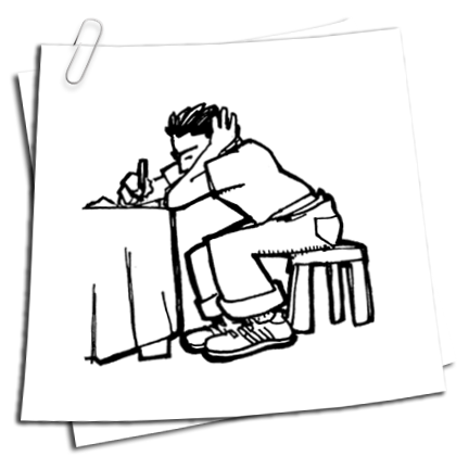
Sketchblog

Kevin asked me to create a logo for his video company: Quoth Kevin:
"...something a little more baroque/russian futurist/steampunk - like a blueprint for a redesign of an alternate-future video camera with a lot of swoopy curves and stuff. Hell of a lot more work, I know."
It's cool, Kev. You're shooting my wedding.
Above is my first stab, and then out of boredom, I put it in an environment. I kinda like how it looks. And I want one.
Monday, February 18, 2008
Sausage Factory: Done Got Hitched, Part 2
Molly's out of town this week, so it's just me and the cats and the Mac, which leaves ample room for some real nerdly design work. I've got some great paying stuff coming up that I'm looking forward to, but right now I've got the looming project that is far more pressing: figuring out how our wedding in November is going to be graphically represented. This is the second part of a series. You can see how we got to this point here.
I don't have much to say except that this is harder than I initially thought, and I'm not sure whether it's because it actually is a challenging project, or that because it's so personally important to me, I'm hyper self-aware. In any event, I think I'm getting closer to where we want to be.
Diving right in to what I did tonight:

I like this, because it gives a nice feel of that beeeeautiful Haeckel etching that I've latched on to, and it also brings an element of art nouveau wallpaper in the background, as it feels like it's being pinned up on a wall. It's way too busy though, with too many colors.

I like this one more because it brings the elements together, but again, while I love the design, the pinks leaves me limp. Next.

This is the choice for the understated fan that likes to let the art speak for itself, and I can see that point of view, I really can. To me, it seems a little snoozely, but then, I'm also a guy who likes a lot going on in a design.

NOW we're cooking with gasoline,, baby. This sucker jumps right off the page, and seems to be modern while at the same time hewing very close to the design of yore. I like this one a lot. But I'm only half the deciding team, so who knows what The Boss will bring down.

I like this one a lot, too: with the addition of the red pitcher plant, it suddenly takes on a vaguely Spanish feel for some reason, which I'm not totally against, though neither Molly nor I have anything to do with Spain at all. I like that is starts to recall art nouveau moving into more stylized form, and is hence historically accurate for the time period we want to evoke. The drawbacks are that it's kinda vaginal, which might come off as weird. But, hey! Everyone loves vaginas!
Like I said, I'm alone all week, so there will be a ton more of these being cranked out. Stay tuned...
The Conquest of Space
I just bought the DVD today on Amazon of these old Wonderful World of Disney information cartoons. I love the atmosphere of this thing: it's part Wagnerian grandeur, part Kennedy-esque optimism, with just a dash of magical realism thrown in for good measure.
Monday, February 11, 2008
Coffee Poster

(Click to enlarge)
Above is a new poster I did for Blue Flavor: they're asking different artists to do posters that relate somehow to the work they've done for various clients, and I'm the first artist they asked, which is totally cool. The client for this poster is LiveMocha, a site that joins people together into a community for learning languages, via Web 2.0 (ugh) concepts, etc., usability, etc. The upshot is that I got to do this totally cool poster, and they loved it. Apologies to The Perrystag for totally stealing some of his thunder.
Thursday, February 07, 2008
The Troubles

While searching Flickr for copyright free shots for comps for the agency I work for (dirty little internet secret), I stumbled upon this brilliant photoset by a photographer, Peter Denton in the UK who, for a time, worked as the still photographer for the UK program "This Week", documenting the upheaval in Ireland at the time. Besides the lovely framing, the quality of the images, somewhere between post-apocalyptic and magical realism , is only enhanced by the heavy red and yellow tone of the film and the overcast sky. Red vans, pink berets, coats of arms, blue graffiti, yellow banners. Sometimes, a set of images taken together carries a weight the one alone can't.
Subscribe to:
Posts (Atom)