So I've decided to start doing something on this blog I'd like to call The Design Sausage Factory, because I like the sound of that, and I've had a little wine and it sounds totally fine to me right now. I thought it might be cool to document how a design or illustration that I'm working on starts out when it's first concepted, and then update it with various installments until the final product comes shooting out the gristle-caked slough onto the slick factory floor below, glistening with fatty design-y residue of another concept hog butchered in the name of an idea . I'm always really amazed at how certain design projects and tones can change over the course of time, and I never really save different iterations, so I figure this is as good a venue as any. Not only do I get see myself how it progressed, but so do all seven of my readers. (Hi, Dad!) So strap on your company-issued hard hats, folks: the factory floor calls!
The project in question is actually one of a rather personal nature, which is great because I actually care about it more than most (just kidding, paying clients!). As you may know, the lovely Molly and myself will be getting married this November, and such a big event of this nature always is in need of some serious design direction. Without a cohesive identity, defined themes, and a sensible pallette, the whole thing will spiral out of control, we'll break up, and the building we're getting married in will probably set on fire. I really, truly believe this. This is what happens when a visual nerd gets married.
(...and for those of you guys out there who think that I'm being a sissy for caring about the visual identity of my wedding: turn your back on your girl for a second, and you may end up wearing a
pink bowtie. Heed me now!)
In all seriousness, though, there were certain tones and themes that both Molly and I talked about wanting to evoke, and so the closer we hit to our mark, the more success we feel the event will be.
So.
Step One: Themes
Luckily, I happen to be marrying a girl who is with me in firm belief that there is nothing worse than
this or
this or
whatever. So let's just wipe that crap right out.
We're both rather nostalgic for times past, we both really enjoy a certain early 20th century iconography, and we both think the saccharine sweetness wrapped around some weddings is, well, kinda gross, so we want to pull it more to a quirky, esoteric, and nearly DIY feel. We're also having our wedding very close to Halloween, so we'd like to encapsulate *some* of that feeling (ornate decreptitude, interesting foliage) with out most of the traditional ridiculousness (Hot Topic, goths). As you can see, the target we are trying to hit from a visual point of view is very narrow, and hence takes a great deal of focus.
Step Two: Influences
- 1893 through 1925, and the associated themes
-
Art Nouveau-
The White City-
Traditional book binding-
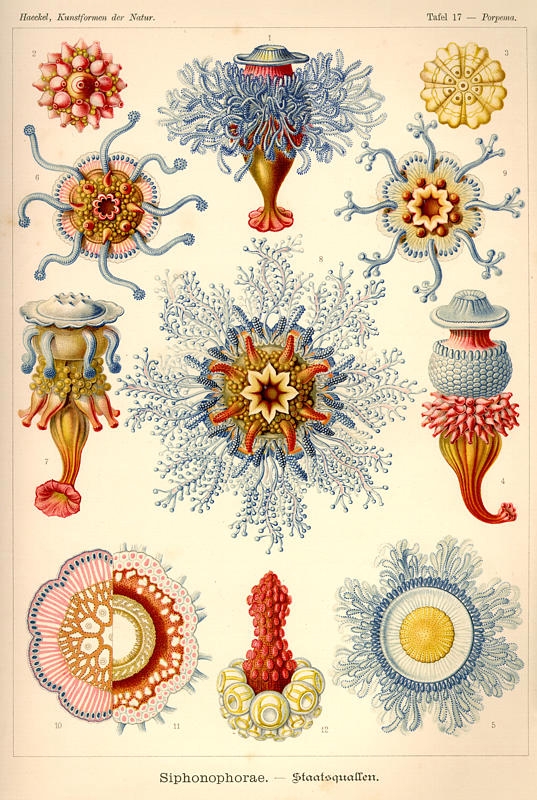
Scientific etchings-
Taxidermy-
Pre-Edwardian typography and patterns-
non-traditional flora- Perhaps even
Art Deco, if we feel like stretching the time period.
(Thanks, HC!)
Step Three: Palettes and Font Options
So, having throughly processed all the images we pored over, I came with a set colors that seemed to recur many times:

...and the best I could do with my current set of fonts that seemed time appropriate, though I'm not really thrilled with any of them.

I have, however, just been turned on to
a set that seems kind of perfect.
Step Four: First Attempt
So this is what I got from just kind of screwing around:

Neither of us are thrilled with it, but we agree it's going in the right direction: the colors seem right, but there needs to be more wedding and less wallpaper. Stay tuned...


