Joe Alterio's blog on illustration, comix, design, animation, and other bouts of total awesomeness.

Showing posts with label movie posters. Show all posts

Sunday, September 07, 2008

Quirky and Fun!

I was at the video store with Molly last night, and I saw this:


It's a DVD cover for a new indie flick entitled "The Go-getter", and allow me to point out a few things.

1.) This movie is clearly aimed at the 24-40 year old This American Life-loving, Decemberists-listening, vegan-eating, guiltily-two-car-owning yupster set.

2.) The car apparently so prominently featured in the movie is an 80s Volvo 240DL, a car which I not only owned and loved for quite a while, but a car that speaks to a greater truth about the owner: that s/he has parents that bought the car, and gave it to them to it's waning years, which pretty promisingly puts the family into the East Coast/West Coast liberal leaning college- educated electoral demographic.

3.) Hollywood's decision to appeal to that (my - oh, god, so embarrassingly so - my) demographic has revealed a pretty steady formula. To wit:


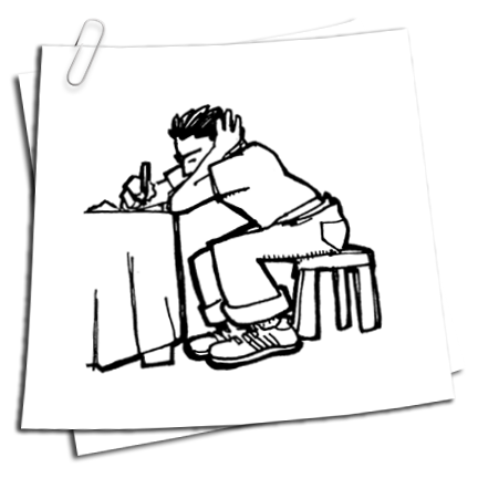
I'm kind of torn about this: as an illustrator that would love to do a movie poster, I'm encouraged to see comic-style drawings and hand lettering on a poster. But, for the love of Tom Brady, surely we're in a rut. It looks like there's a InDesign plug-in for this type of design now. So, it is with a heavy heart that I say:

You designers, STOP IT. STOP using blockhead font, stop using slightly sloppy hand drawn illustrations, stop using bearded motherfuckers to portray to the potential audience that this about people who read Sarah Vowell and wear tweed jackets. STOP IT.


Please, surely there's another way.

In other news, you can see why I'll be launching a new look for my website next week. I'm guilty of the same design crimes above, and someone's gotta say something. It might as well be me.

Wednesday, May 02, 2007

The Hijinx Ensue


As a former teenaged, pimply-faced usher at a movie theater, I'm well aware of how important a movie poster is to it's success. I don't have any solid data for this, but there's something about a good poster for a bad movie (even a movie with such promise!) that seems to be worth the investment: once you get people in the door, it doesn't matter that your story sucks and the acting is atrocious. You already have their 10 bucks!

Posters, like other design media, go through trends, and few are more mysterious or distinctive to me than the painterly, heavily-caricatured movie posters of the mid-70s through late 1980's. Fallen out of favor now, the movies they advertised regularly occupied one of two catagories, either the multi- cast-adventure-movie, or the Animal-House-inspired wacky comedy.

A little digging around (on my new favorite site) found that a likely progenator of this style is Drew Struzan. His site is kinda off the hook, because he seems to have had a hand in every famous movie on the planet. And this, folks, is why I love illustration. While the gallery artist makes a name for himself above all, the workhorse illustrator slyly burrows himself into the popular consciousness, a covert operative of style and aesthetic. At a certain point, if an illustrator is good enough, his or her style is almost taken for granted, like it's own school, so ubiquitous as to have imitators who don't even know who they're imitating. And when, like I did just now, one does finally find the creator behind so much of what you see before, it's like the ultimate reveal: you see, finally, the man at the controls, and are so much more awed by it.