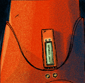
As you may or may not know, I'm a rabid poster fan, and my design sensibilities have been informed by all manner of poster art from the very begininngs. What I've been trying to accomplish visually with The Basic Virus is an homage to not only the ideas' beginnings in poster form, but to the simple, clean design concepts present in the early 20th centuries advertisements and billboards. Above is a frame from the Prologue of The Basic Virus, my new webcomic; before I get any further (Episode 1 is coming soon!) I'd like sound off about the difficulties of translating a design concept from a more antiquated medium to our current faster-cheaper-more-out-of-control way of making cool stuff, and maybe get a few helpful recommedations along the way.
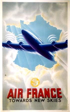
Below is the firsy of two examples of the poster art I really love, both 'borrowed' off the fabulous site La Belle Epoque Posters, which I often surf in my off-hours and wistfully hope that a spare 3 grand has suddenly appeared in my bank account.

The first thing we can say is that, besides being executed by a draftsman superior to me, it's what seems to me a charcoal and chalk drawing on printmaking paper, turned even more vibrant in the litho process, while mine is clearly a product of Illustrator and Photoshop, on top of pen and ink. See how his whites are more evocative, his lights more blended, the sublte shading creating a greater sense of drama. And this is what bugs me. While I admit I'm not the greatest digital artist to stroll in face of the Earth, I consider myself competent enough in what I do. I'm troubled by the fact that it might just be that, lest I actually do every single one of my panels in the traditional manner, I may not be able to exactly duplicate the feeling I get when I look at these posters in my comics. And this bothers the hell out of me.
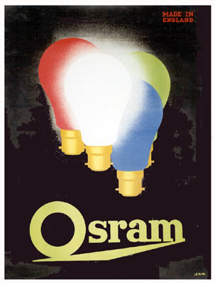
Here's another wonderful one, not only for it's similar use of the gradient shading, but it's straight up design sense. Man, don't you wish companies still paid for ads that look like this?

I'm OK that I can't duplicate these master's work: my work is my own, and I have my limitiations, like time and narrative pacing. But I'd really be blue if I thought that the feeling these give is unattainable in the digital world.
**Sorta unrelatedly, Clickwheel will be at the San Diego ComicCon this July, and invited me to tag along as a Contributing Artist: we might get to be on a panel and everything. How official. In any event, I'll be doing my darndest to get my sorry ass down there. Sweet!**


No comments:
Post a Comment