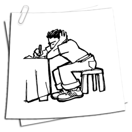
It's a DVD cover for a new indie flick entitled "The Go-getter", and allow me to point out a few things.
1.) This movie is clearly aimed at the 24-40 year old This American Life-loving, Decemberists-listening, vegan-eating, guiltily-two-car-owning yupster set.
2.) The car apparently so prominently featured in the movie is an 80s Volvo 240DL, a car which I not only owned and loved for quite a while, but a car that speaks to a greater truth about the owner: that s/he has parents that bought the car, and gave it to them to it's waning years, which pretty promisingly puts the family into the East Coast/West Coast liberal leaning college- educated electoral demographic.
3.) Hollywood's decision to appeal to that (my - oh, god, so embarrassingly so - my) demographic has revealed a pretty steady formula. To wit:


I'm kind of torn about this: as an illustrator that would love to do a movie poster, I'm encouraged to see comic-style drawings and hand lettering on a poster. But, for the love of Tom Brady, surely we're in a rut. It looks like there's a InDesign plug-in for this type of design now. So, it is with a heavy heart that I say:
You designers, STOP IT. STOP using blockhead font, stop using slightly sloppy hand drawn illustrations, stop using bearded motherfuckers to portray to the potential audience that this about people who read Sarah Vowell and wear tweed jackets. STOP IT.
Please, surely there's another way.
In other news, you can see why I'll be launching a new look for my website next week. I'm guilty of the same design crimes above, and someone's gotta say something. It might as well be me.


2 comments:
Wow, you nailed it.
I thought you were gonna post a scan of that road-trip photo of Simkins standing on top of your car... I remember it vividly for some reason, elegantly printed in black and white taped to a USC dorm-apartment wall...
It's up to you, Alterio! What's next, design-wise?
Besides, I was on top of this shit like 4 years ago, anyway...
http://www.flickr.com/photos/joealterio/2905064361/
Post a Comment